Yahoo Mail - email from Yahoo for iPhone Review
Yahoo! has certainly struggled to remain relevant in a fast-paced world of consumer technology, and you could argue that its new standalone ...
https://iskablogs.blogspot.com/2013/07/yahoo-mail-email-from-yahoo-for-iphone.html
Yahoo! has certainly struggled to remain relevant in a fast-paced world of consumer technology, and you could argue that its new standalone email app, Yahoo! Mail for iPhone, has arrived a little too late. But it's easy to forgive Yahoo! for not being super-speedy to market because this app delivers a much richer email experience than the one iPhone owners are accustomed to with Apple’s bundled Mail app.

The free Yahoo! Mail app is similar to Gmail's standalone iPhone app in many ways, while still retaining plenty of the core Yahoo! identity, although Gmail goes above and beyond. Like Gmail's app, Yahoo! Mail centralises your whole email account so that you can access everything in it with greater efficiency. In comparison, Apple’s Mail app puts the inbox at the fore and makes getting into other folders and settings much more difficult.
Many people, I'm sure, will continue to use Mail as their primary email application because it can show you many inboxes from multiple services at once, but you'll want Yahoo!'s app if you use Yahoo! Mail fairly regularly – particularly if you want detailed push notifications, which will flash the subject line of new emails on your screen. Also, Yahoo! deals very smartly with emails formatted in HTML.
Mail vs. Yahoo! Mail
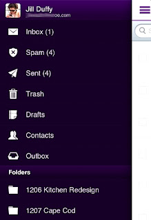
The Yahoo! Mail app has an interface design that mirrors both Gmail for iPhone and Facebook for iPhone (and now many other apps), with a collapsible menu pane that swings into view from the left. Toggle the menu open, and it takes up not more than half the screen so that it's roomy and easy to read.
Here, you'll find your folders, such as Inbox, Spam, and Sent, as well as all the custom folders you've made. Trash, Drafts, Contacts, and Outbox live here, too. Missing from Yahoo!'s app but present in Gmail's is an "All Mail" option, which is necessary if you want to search for an item across your entire account. It's no surprise that Google, the first name in search, is the field leader in terms of email searching, too.
Towards the bottom of the menu panel are app icons for Yahoo!'s general app, as well as Finance and Messenger. Press these icons, and the affiliated program will launch if you have it installed, or you'll be whisked to the iTunes store and prompted to download it.
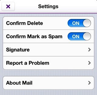
 At the very end of the menu are Tools, namely Settings (which are light), and then two buttons for "Share This App" and "Rate This App." It would have been better if Yahoo! had dropped these last two promotional buttons, and instead included more in the Settings, like out-of-office or vacation message controls, as Gmail has done. The settings in Yahoo! Mail cover the bare minimum: Confirm delete, confirm mark as spam, signature, and areas to report a problem or read more about Mail (which only shows the version number of the app).
When you first install the app and login, you can opt to receive push notifications, which Yahoo! has designed well but implemented less successfully. Standard push notification displays, like being able to see the subject line and sender of a new email from the lock screen, work fine, but the badge number count of unread mails is buggy. It continues to tell me I have one unread piece of mail, even though all my messages are clearly read. The Mail app knows all the email has been opened, so something's off in Yahoo!'s app.
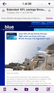
Emails display cleanly, even those using HTML (see the image below). I'm not sure if some of my image-rich messages loaded in full because I've marked the sender as safe, but in the stock Mail app, the same messages appear as having broken images.
 There are two more areas where Gmail's iPhone app trumps Yahoo!'s: Threaded messages, and support for multiple accounts. Gmail always colour-codes email threads by sender, so you can tell at a glance when a new person replies. Google also lets you have multiple Gmail accounts right in the one mobile app. Yahoo! just doesn't offer these features, although it has only just been released. Over time, it will hopefully learn from its competition.
Verdict
Both the Yahoo! Mail app and the iPhone’s native Mail app connected to a Yahoo! account do a fine job of getting your messages to you when you're not sat in front of a desktop computer. Which one you choose is largely a matter of how you use email. The Yahoo! app works well for those who visit every nook and cranny, from custom folders to the Outbox, frequently. It's also much more engaging for graphic-rich emails. But to see all your mail from all your accounts at once, the Mail app is still the place to be.
uk.yahoo.com


