
Hello Honeysuckle!
As I mentioned before, Pantone has released its Color of the Year for 2010: Honeysuckle. They describe it as a color that allows to " ...
https://iskablogs.blogspot.com/2010/12/hello-honeysuckle.html
As I mentioned before, Pantone has released its Color of the Year for 2010: Honeysuckle.

I'm unsure about using too much in room without becoming too Miami Vice. But, I think it is a perfect choice to punch up a neutral space.
Here are some "pink" rooms that I find inspiring:


Most it of all, it reminded me of the living room designed by my beloved Sarah Richardson and Tommy Smythe for Sarah's House.


They describe it as a color that allows to "face everyday troubles with verve and vigor. A dynamic reddish pink, Honeysuckle is encouraging and uplifting. It elevates our psyche beyond escape, instilling the confidence, courage and spirit to meet the exhaustive challenges that have become part of everyday life.” Their prediction is that we will see this color everywhere from lipstick, nailpolishes, dresses, pillows and even appliances?
It is definitely a bright and bold color, like last year's Turquoise. Inherently it's color that seems to lift our spirits and bring a sense of optimism. I always say that wearing pink is like an instant natural blush! Plus, it's just plain pretty!
Here are some "pink" rooms that I find inspiring:


Most it of all, it reminded me of the living room designed by my beloved Sarah Richardson and Tommy Smythe for Sarah's House.
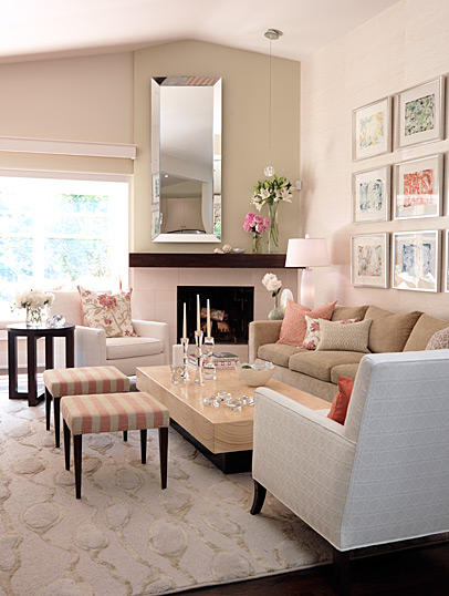
Just enough pink... I mean honeysuckle.
I would love to know what you all think. Love it? Hate it? Are you all rushing out to buy honeysucke accessories? Do you find it too feminine?
And one more.. I'm curious. Just for fun.. what do you think of this one? Too much honeysuckle? Those cupboards are amazing but the color I'm not so keen on.. :)


